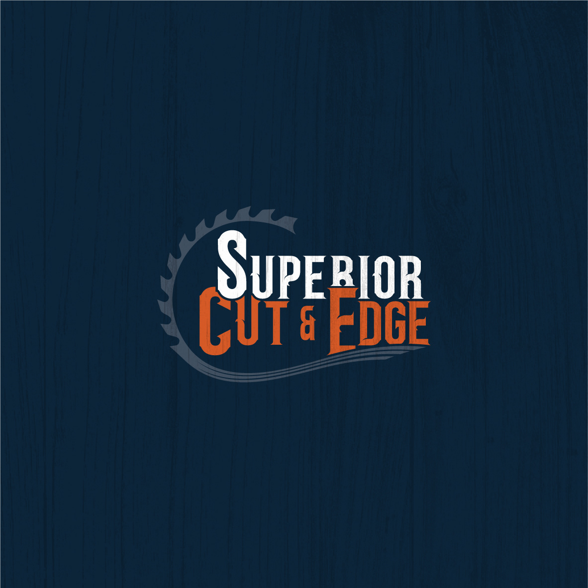
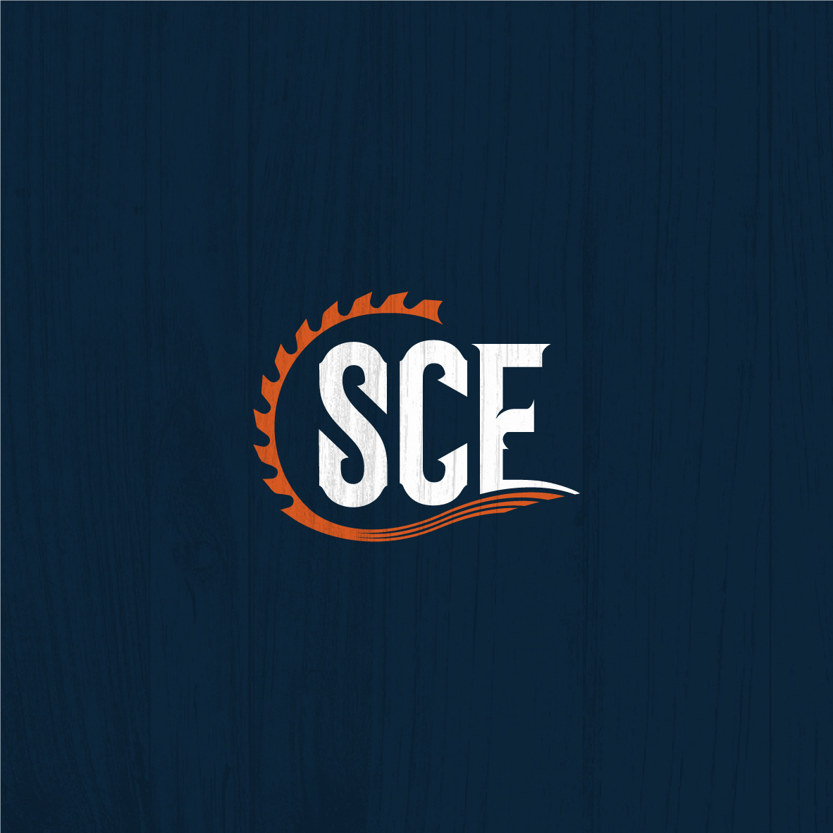
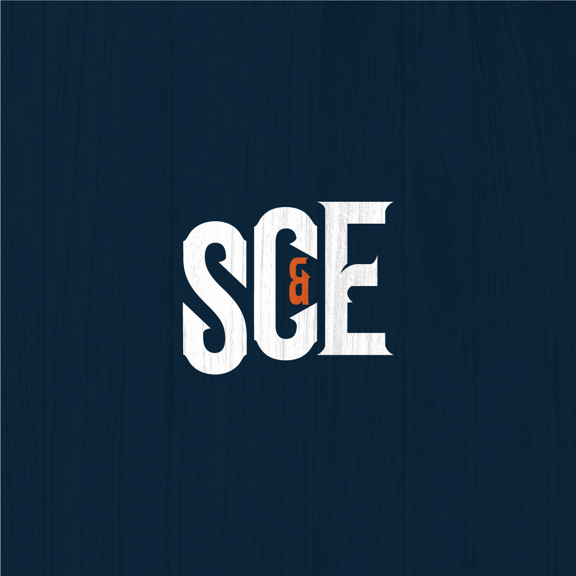
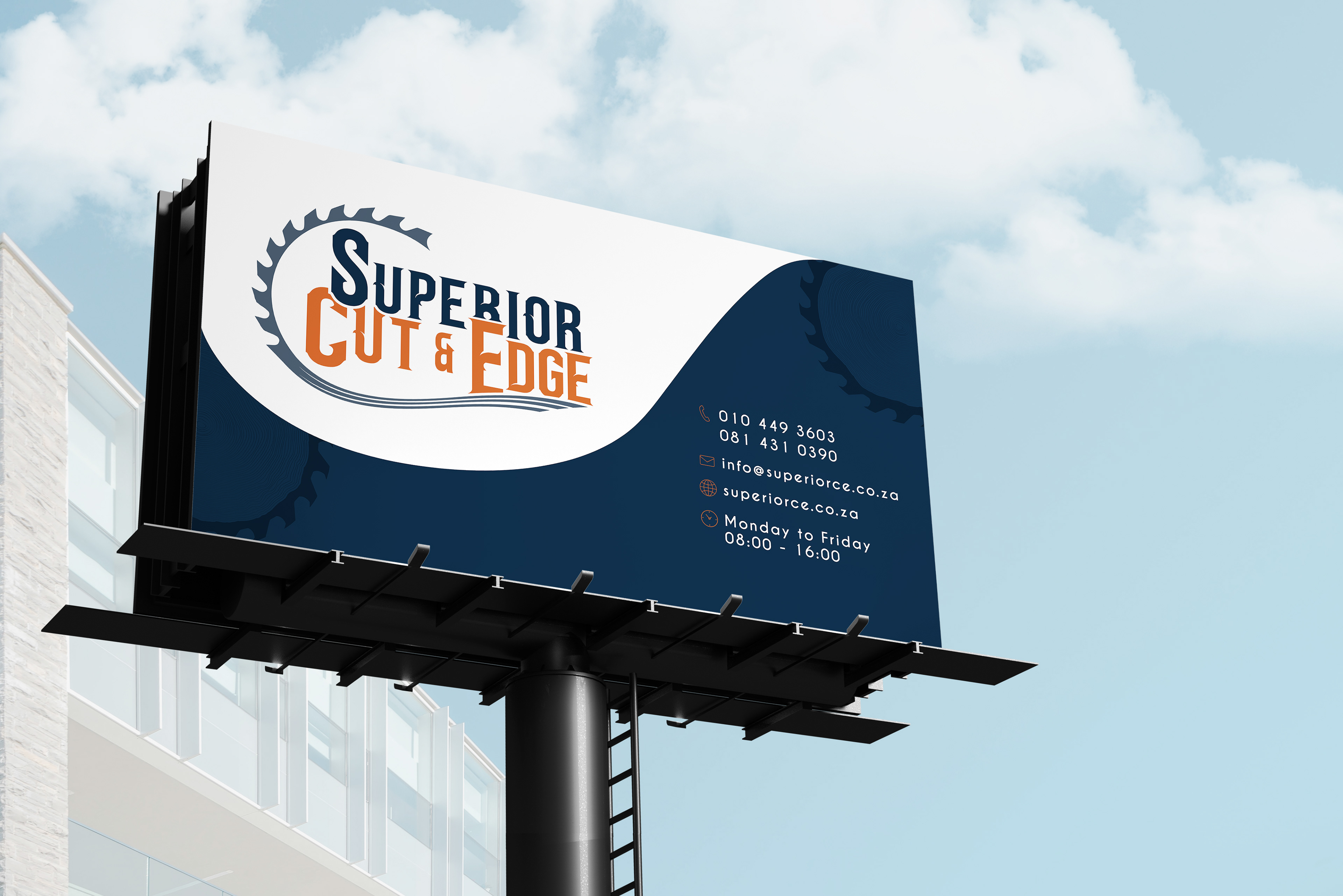


For this company, the direction was primarily focused on the abbreviation of Superior Cut & Edge - SCE. The client wanted cutting and edging of wood to form a part of the logo, and this is what we created. A color pallet was created using blues and orange that compliment each other very well.